Callahan’s Peer-to-Peer financial analysis tool helps credit unions put data into context. Now, interactive graphs on CreditUnions.com offer that same level of context to readers.
Moving forward, readers* can click on identified graphs to automatically pull up that data in Peer-to-Peer. From there, it takes only a few clicks to customize the graph and compare any credit union’s performance.
Please note, the graph in Peer will display data for the user’s identified primary and peer groups rather than the comparisons shown in the article.
Reading + Analysis=Game-Changer
Callahan’s insight featured on CreditUnions.com can help readers take their own credit union’s performance analysis to the next level. After all, readers can learn a lot from evaluating the strategy and performance of other credit unions.
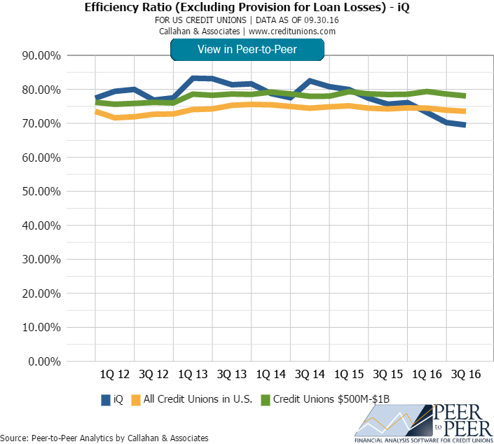
CreditUnions.com often features graphs like the one above, for example, as a part of its examinations into the industry’s best practices. In this case, Callahan might be looking at a credit union with a larger than average branch network and a belowaverage efficiency ratio. The article shares tips for how to operate so efficiently, which is helpful in generating new ideas. And the graph is helpful in showing the performance for a specific group of credit unions. But how can readers determinehow their credit union compares to credit unions in similar peer groups, fields of membership, business models, etc.?
This is where Callahan’s embedded Peer-to-Peer graphs can save readers time and spur their thinking about how to make their credit union operate more efficiently. With the new Peer-to-Peer graph functionality on CreditUnions.com, a few simple clicksis all it takes to create a custom graph that offers more insightful analysis.?
Here’s How To Do It:
- Click on the graph embedded in the CreditUnions.com article. This will open Peer-to-Peer and show the graph featuring data sets from the user-selected primary and comparison credit unions.
- Want to change the comparison? No problem. Create a new peer group by clicking Comparison Set > Create New. Then click Create.
- Under financials, type branches and set a minimum and maximum.
- For better insight, add additional criteria, such as an asset range, geographic location, number of employees, or FOM requirement.
- Name & Finish and choose to add the group to the current display
Example Of The Graph You Will Be Able To Build In Peer-to-Peer
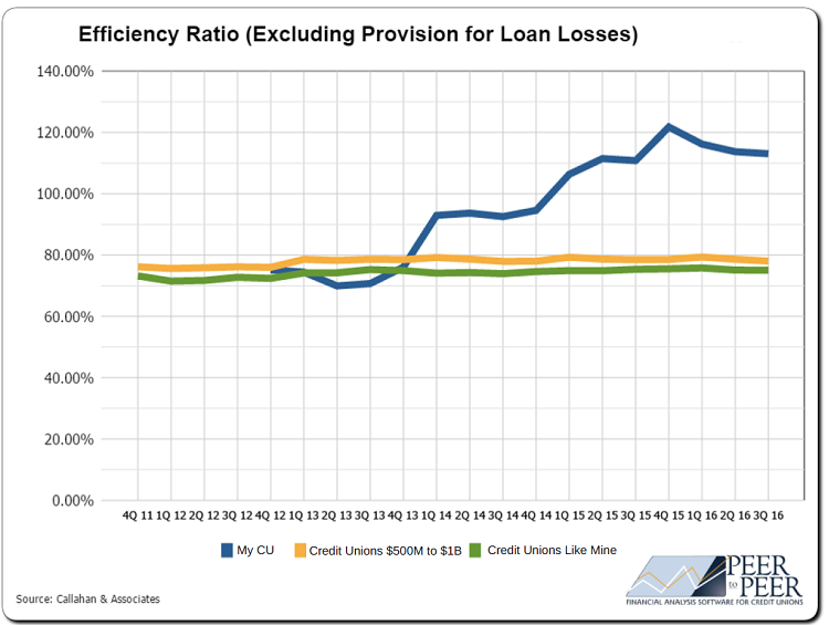
Source: Callahan & Associates.
After analyzing a credit union’s specific data, a reader might discover their credit union is performing above or below credit unions that operate under a similar business model, asset size, etc. A quick visit back to Credit Unions.com can helpthem learn more from leading credit unions about how to improve performance or turn a good strategy into a great one.
*Readers must have a current subscription to Peer-to-Peer in order to utilize the embedded graph feature. Interested in learning more? Contact us today.
SEE IT IN ACTION
Want to see Callahan’s embedded Peer-to-Peer graphs in action? Check out these articles:
12 Ratios Every Marketing Manager Should Know?
ACH Data Means More Lending For A NY Credit Union?
How Partners FCU Markets What Its Members Want
Need help? Contact us.
