Top-Level Takeaways
-
The user experience begins by answering questions about financial goals. That begins a matching process to products and services.
-
After a mid-2018 launch, refinements are now focusing on making the mobile app where most prospective members initially engage more balanced between form and function.
CU QUICK FACTS
Patelco Credit Union
Data as of 03.31.19
HQ: Pleasanton, CA
ASSETS: $6.9B
MEMBERS: 350,055
BRANCHES: 37
12-MO SHARE GROWTH: 9.1%
12-MO LOAN GROWTH: 13.4%
ROA: 0.95%
Patelco Credit Union ($6.9B, Pleasanton, CA) is a year into its new digital presence, built around helping members map their credit union journey by matching financial products to financial wellness.
The big idea is to provide a needs-based user experience that allows members and prospects to choose a guided experience tied to their goals, such as paying for an education or a home.
The home page journey begins by filling in the blanks to an I want statement that then directs the user to loans and saving products, along with calculators and educational information and the ability to talk or text with a member service representative.

Elaine Hamann, Vice President of Digital Delivery, Patelco Credit Union
This holistic approach to member engagement is building on a record of strong metrics such as 2.33 share accounts per member (the average for all 5,451 credit unions in the U.S. is 1.91) and an average member relationship of $31,805, compared to the national average of $19,156.
That’s in addition to a score of 93.20 out of 100 in Callahan’s Return of the Member (ROM) index that measures the value a cooperative returns to its member-owners.
Now the big California credit union is polishing its presence. We’re working right now on changing our mobile template, says Elaine Hamann, Patelco’s vice president of digital delivery. It’s all an iterative approach for us. We’re in a continuous assess and iterate’ mode.
Here, Hamann provides the soup-to-nuts story on Patelco’s innovative digital financial service and wellness strategy.
Let’s begin by asking: What’s the driving philosophy, the ultimate strategy, behind digital delivery at Patelco?
Elaine Hamann: We want to make the overall experience easier. We want to fuel progress towards financial health. And we want to show and tell how we’re all in this together.
How do you define digital delivery at Patelco and how does your website fit into that?
EH: It’s about supporting the entire member lifecycle and delivering our products and services through the online channel from acquisition to new member and new account onboarding to service and ongoing member engagement and participation. Think of it as the ability to effectively acquire and support members where we don’t have physical branches.
Our website is the digital face of our brand, and its primary role is to demonstrate our commitment to helping our members build their financial health and well-being, and how we put our members’ interests first in the products, services, and educational resources we provide to do that.
Our online banking site is where our current members engage the most to manage their day-to-day financial needs. Prospective members are a primary intended audience of our mobile presence.
Please describe the strategic planning process as a continuing effort in regard to digital banking at Patelco.
EH: Think of it as a formula: Patelco corporate goals + internal partner priorities + online banking platform vendor roadmap = strategic planning process. Our partnership with our online banking vendor is part of our intentional strategy on how we remain competitive with our online banking services. They have an innovation roadmap for desktop and mobile capabilities.
Please describe the design, and how it ties financial wellness and goals to products and services.
EH: The user experience and content strategy work together to optimize the experience for both direct and guided (needs-based) paths to Patelco solutions. We intentionally designed the guides to enable exploration of our products and services based on prospects’ and members’ needs through what we call the I want to module. We also offer direct paths to that information.
Both the home page and our Explore Services menus support this dual path. The guided experience takes the user through a brief assessment quiz and based on the user’s results, highlight relevant solutions to his or her situation.
For example, if users indicate they want to buy a car, they’re presented with a brief quiz and provided with results that tells them how much they can afford and the relevant Patelco solutions to meet that need.
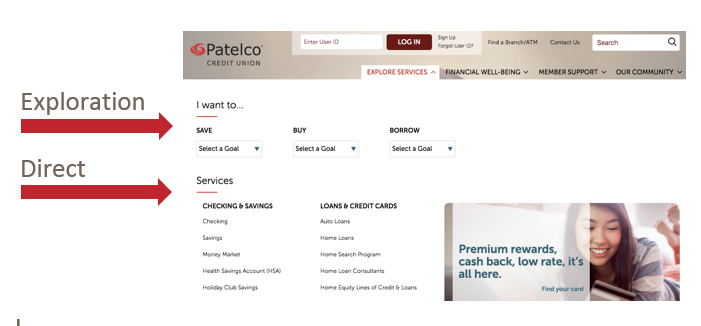
From this web page, Patelco members can go directly to a product or service, or they can explore based on their personal objectives and goals.
How do you measure success with your website, and what metrics matter most?
EH: Membership growth, deepening participation in solutions and services, satisfaction, with the end goal of increasing members’ financial health and well-being.
All the other goals feed into this outcome for us. We want to bring more people to membership, where they have access to the services and solutions designed to help them achieve financial health and well-being.
Please describe how you integrate the user experience to be the same as possible on laptop, desktop, mobile app, and tablet.
EH: For the website, it’s a mobile responsive design so users get a consistent experience across device types. The mobile app, naturally, has its own app-based experience.
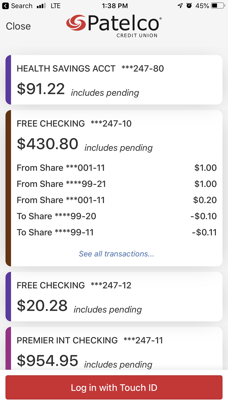
The Snapshot feature on Patelco’s mobile app provides a view-only look at balances and pending transactions without the need to log in.
What have you learned since you launched the new website?
EH: First, the importance of the mobile experience for prospects. More than 60% of our prospects arrive at our site through their mobile device. We’ve learned that there’s a delicate balance between supporting a visual design that focuses on high-impact images and making a human connection and web usability.
To put it tactically, the images take up a lot of space. As much as some say focusing on above the fold is less important in a mobile web experience because people on their phones are used to scrolling, our heatmap analytics are saying differently. So we have more work to do with optimizing the responsive experience for mobile.
For existing members, they’re more OK that the login fields are so prominent in the mobile view of Patelco.org as logging in for online banking is their primary objective. But it’s not optimal for a prospect experience.
How did you get that feedback?
EH: With a combination of site analytics tools, site search user analysis, and user feedback collected through ForeSee’s feedback survey.
What specific changes have you made as a result, and why?
EH: We’re working right now on changing our mobile template. It’s all an iterative approach for us. We’re in a continuous assess and iterate mode.
What third-party partners have you used in this digital journey?
EH: We use Alkami’s digital banking platform. We also work with Financial Health Network (formerly CFSi) on financial wellness.
Also From Patelco:
-
How A New CEO Watered The Garden And Watched Her Credit Union Bloom
-
Better Hires, A Glassdoor Strategy In California
-
How To Succeed In Wellness Programs
What would be a few bulletable best practices/lessons learned/pieces of advice that you can share with other credit unions considering adopting a similar strategy for their digital presence?
EH: Let’s divide it up this way:
- Measurement and analytics. Define your success metrics upfront and make sure you include and implement your digital analytics and measurement plan as part of the project scope. Know what you need to tag and track, and who’s going to create the dashboards and other responsibilities.
- User-centric approach to design strategy and testing. Build in time and budget to test along the way. Resist being heavily influenced by internal design feedback. Everyone internal is unconsciously biased. Test with your target audience (prospects, existing members, etc.). Start with testing the redesign concepts and progress to deeper, more tactical levels of user testing as you progress in the redesign work. Test nomenclature, navigation, top user tasks, and journeys.
- Ongoing maintenance and governance. As part of our re-design, we converted from an inefficient, home-grown website to a new CMS platform. Working with a CMS was new for our internal teams and we had a skills gap with working on the new platform. Additionally, having a CMS changes your governance model as you can choose to fully decentralize content management to different parts of your organization. But just because you can doesn’t mean your stakeholders want that new accountability, because it includes being trained and potentially changing how they work today.
Bottom line: plan upfront for who will be maintaining the new site, and how they’ll do it, and work through your governance model.
This email interview has been edited and condensed.